Sunday, June 13, 2010

Design Studio Project 3 - Model


The large window on the 1st floor give people a good street view.


Interior looking of the gallery. Some parts are slightly different from the drawing because the sectional cut affects the structure.


Overall view.

Design Studio 3 - Presentation board


It's an A2 poster used in final presentation. It's not in good quality because I used the ploter in our faculty building... I should have gone to a print shop...

Design Studio Project 3 - Plans & Section


Site

Site with gallery footprint

1st Floor Plane


Ground Floor Plane

As seen from the planes, the gallery is designed to be two pentagons one on the other. Large
Blank walls are used to create the feeling of isolation - which indicates Polke's idea of "in his own world". A courtyard is placed near the entrance of the building as a main natural light source for the ground floor. The back of the ground floor, which is lack of natural light, has been used as the storage and a public resting area attahed with a small kitchen.
On the first floor, a wide gap is cut so there is a good communication between the 1st and ground floor. This gaps also enabled people to have a view of the courtyard. Sun light is difused and filtered when comig through the large window in the front and the gaps on the roof. Office, apartent and a kitchen are placed at the back of this floor. With another set of staircases behind the building, the artist can enter the storage and his apartment without go through the whole gallery.


Section

1:50 plan to show the lighting features
1:50 section to sow the lighting features

Design Studio Project 3 - Studies carried out and several attempts


Design Studio Project 3 - Precedents


Sapphire Gallery / XTEN Architecture
The Saphire Gallery is a residential gallery addition to a private residente in Los Angeles, California. It is designed to display a private collection of contemporary art while also providing for a home office with views to the sorrounding hills.


Arctic Cultural Center / B.I.G Architecture
The 3 main programs - a theater, a concert hall and a cluster of rehearsal roos - are placed so they define a centrifugal public space tht connects the city to the water and the new harbour front promenade. The dancing studios are wedged between the 3 main programs with beautiful views to Hammerfest's scenic focal points: the mountains, the bay and the historical city. Light cracks between the floating dancing studios and the auditoria provide the public space with the feeling of being under water covered by big floating ice gaps.


Both of these two buildings show the great use of space communication and dynamic roof, especially the Arctic Cultural Center: with blank walls closing the building, a few curtain walls, windows, gaps on the roof and the small courtyard in the building center allow natural light to go into the building with no problem.Work together with the dynamic shape, the Arctic Cultural Center gains apure beauty from all these simple elements.


Design Studio Project 3 - Artist

"Sigmar Polke (13 February 1941 – 10 June 2010) is an artist whose work defies easy definitions. He is one of the most significant painters of the post-war generation, yet his career has by no means been confined to painting. Since the early 1960s Polke has experimented with a wide range of styles and subject matter, bringing together imagery from contradictory or unexpected sources, both historical and contemporary, and using a variety of different materials and techniques. In fact Polke’s artistic diversity, and his resistance to any form of categorisation, has been seen as the only consistent theme in his work. "

I chose him from a list of pop artists when I saw his painting "Fastest Gun in the West". With both innovative ideas from pop art and the restraining of German art. One of his idea became my script in designing his gallery:
"I live in my own world, but it's ok. They know me here"

Monday, May 10, 2010

Design Studio Project 2 - Models


I used balsa wood for the whole building, to achieve a feeling of loneliness and boredom. Newspaper as the site... actually I have thought about using butter paper but in the case of showing a little bit of the man's life in the city, I used newspaper as the fundation of the building. The main reason I want to use paper is, they can imitate the cliff perfectly.

Design Studio Project 2 - Presentation board


Nothing special, just the presentation board I used for Project 2 Presentation. As I was the last one to present, pitifully, I don't think my classmates had seen it. Took me hours to make it. lol

Design Studio Project 2 - Poches


(*click to enlarge*)
The poches are a little bit confusing because the arrangement of the building. This time I tried to use furniture to show the scale Because for my character - who can't communicate with the people in this place (non-Greek speaker) and feel pretty lonely - it better shows no human in the drawing.
Only a few furniture, like sofas and lamp, strengthen the feeling of loneliness.

Design Studio Project 2 - Plans, section & elevation


(*click to enlarge*)
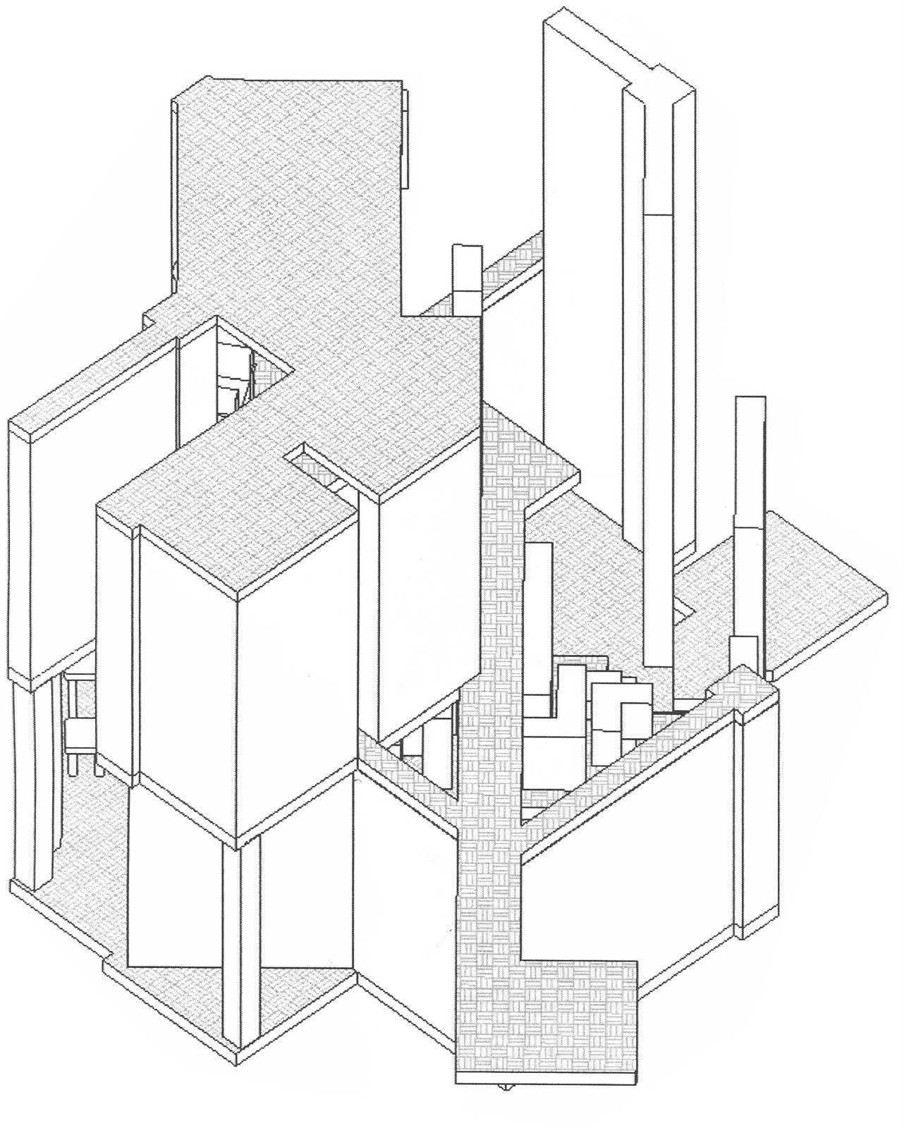
My building is generally a part of a villa for a city man to "escape" from his urban life. So I set the ground floor to 2.7m high which is comparingly low then the first floor. This floor is for his study and work room. Concrete platforms, heavy walls and stairs, few openings for light to come in, all the features form a space with pressure and boredom.

However the first floor is a much open space with no glazing but only openings. As I wrote before, the extending platform is the "jumping off" place for this city man to escape from his boring life. All the openings allow the beautiful "Aegean" sunshine and the lovely sea view to go into the house and to attract the man to jump into the sea (scuba diving I mean...). The narrow pathway is kind of pushing the man, so he can't just stay in the room and have to go to enjoy the
new world outside. As Harold said, it's a journey, a journey to help him feel something different.

Design Studio Project 2 - Sketches


These sketches are done through my whole project. You can tell there are great similarities between them and my second model and my final model. Even though they are not really clear but they really gave me great lot help.

Revit or other soft wares are pretty good at visualization, however while sketching by hands, it's much easier and faster to improve the ideas.

Tuesday, April 27, 2010

Design Studio Project 2 - Rough model, plans & section


Above on the left is the upper level view and on the right is the lower level view.
Well guess these stuff will become my second project. Just got the book 'through the canvas' from the uni bookshop; good book i have to say. Guess i just need some time to understand what's in it.
And below are the plans and the section.

There is a house by Tadao Ando called Shinobu or something like that;there is a great use of light in that house. Same as the house i posted last week, simple combination of walls and openings form a beautiful spce. If minimization is the extreme modernism, then in my project 2, i really need to chop off quite a lot to achieve a "simple but nice" space as i mentioned above.